

I did a postmortem on my last two paintings and came to the conclusion: they’re too complicated. Here I am always talking about big shapes but my pieces had too many small shapes. It is time to simplify.
A few years ago when Colleen Barry was still painting naturalistically, I was enchanted with how she would flatten out some shapes in the middle of a volumetric rendered passage, e.g., a light area, and that flat shape would act as an island of clarity surrounded by gradations of modelling. It would be an emphasis, a sforzando. I asked her, “Do you make these flat shapes first and then render around them or do you render the form and then decide to make an area flat?” She answered that she rendered the form and then chose the area to flatten.
I thought this thinking was fascinating because it told me that she got to know the form by rendering it, and then once she understood the form, she knew what shapes would be stronger if they were simplified.
In my last couple of pieces, I had a figure against a glowering overcast sky. Both figure and sky were fully rendered. I compressed my values to make the shapes bigger but the images were still too complicated. I had not compressed enough.
Well those pieces were heavy on concept so by the time I finished the second one, I was exhausted and discouraged and out of ideas. I started thinking about my friend Larisa Brechun’s painting I had seen at the New Salem Museum of Art because she was onto something I needed. Larisa doesn’t have a good photo of the painting so we’ll have to make do with the iPhone photo I took while I was there, glare and all:
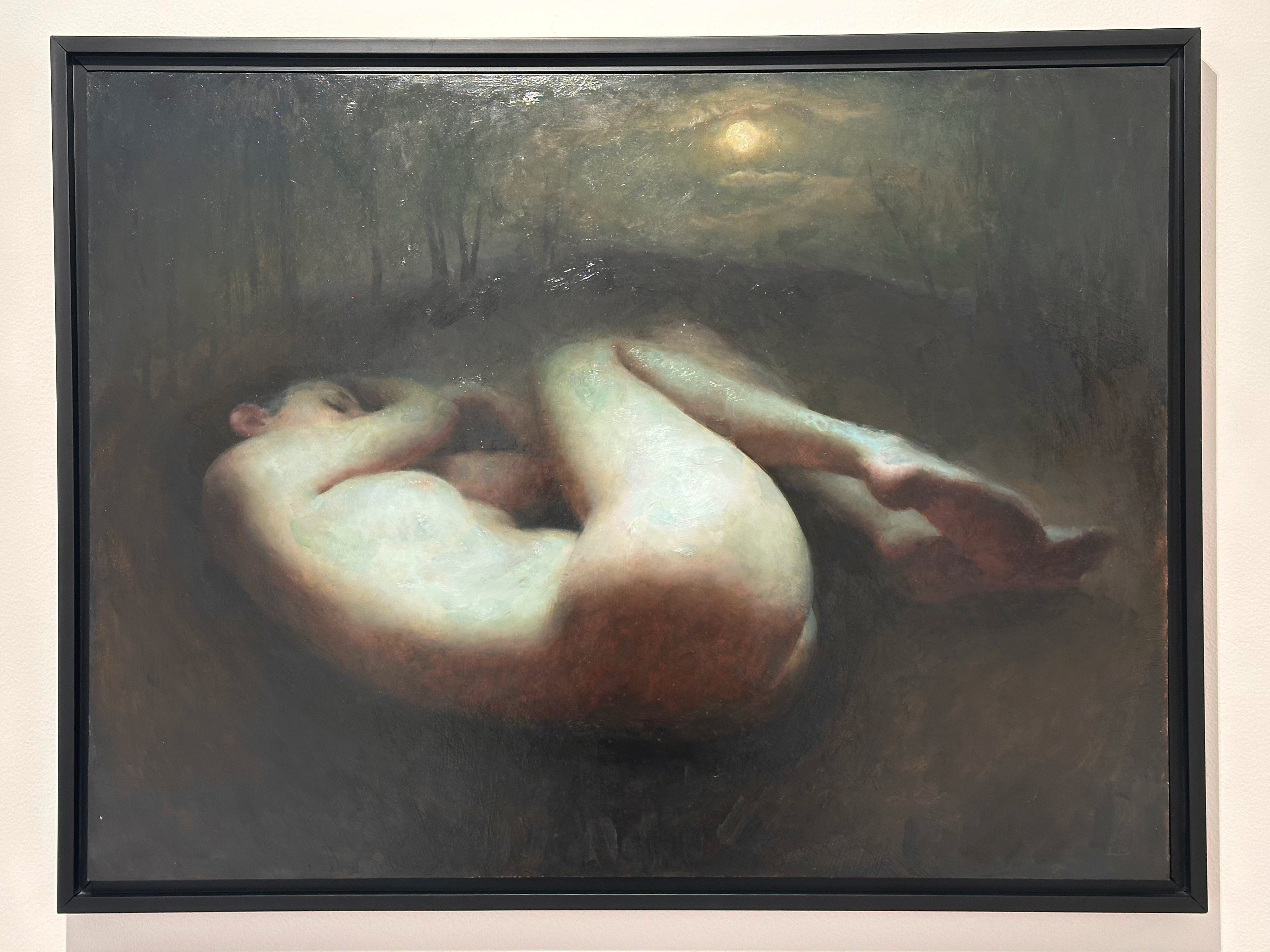
Now what I love about Larisa’s piece is that there’s fricking nothing there. It’s mostly one shape of light against the dark, with a moon and a ton of sophisticated edge transitions.
Elegantly simple.
So while I was burned out I started a master copy of Larisa’s piece. I didn’t ask her what colors she used or what brushes because I wanted to reverse engineer it. I figured she used hog bristle brushes or something similarly stiff but not extremely pointed. She may have used filberts but I figured rounds. I think it’s safe to guess she used transparent red oxide, either veridian or phthalo green, probably raw umber, maybe ivory black, and either a yellow ochre or a Naples yellow. So I got cracking on my master copy and as usual within a couple of hours I was nowhere near done with her master copy but I had an idea for a new piece of my own. Which is why doing master copies is a great thing to do when you’re burned out.
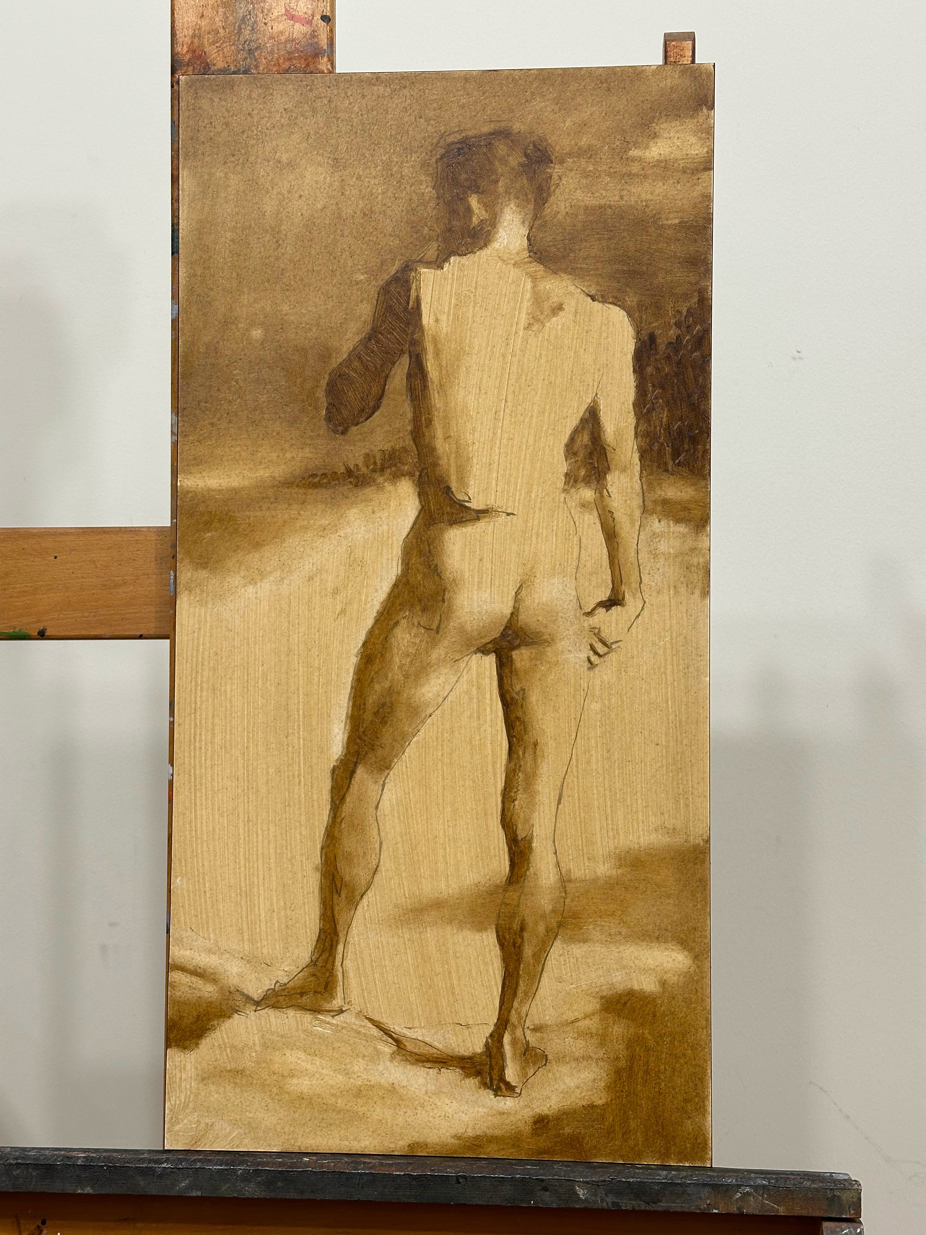
I guessed that she had started with a brunaille of raw umber so I started my master copy and my new piece the same way: I mixed Old Holland’s Raw Umber, which has a deep golden undertone, with mineral spirits, painted it all over the panel and then wiped it off with paper towel so I had a nice even velatura of pretty much a #7 value (on a scale of 1-10, 1 being black and 10 being white). Then while the velatura was still wet, I drew the image onto the master copy with raw umber and a hog’s hair round. I usually find brunailles quite tricky because I can’t get the paint to move on a dry panel so it’s really difficult to control values. I don’t think I had ever tried doing a brunaille on a moist velatura before, and to my delight I found that was the trick. If you don’t mix the paint with anything and you just lay it down straight, the residue of mineral spirits on the panel gives you all the tonal control you need.
So when I started my own piece, I started with a brunaille, which I almost never do, and worked out the composition.
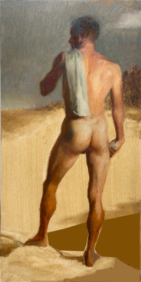
The top of this is working well; I had really simplified the sky and the figure. But I started painting in full color, and when I got to the legs, I saw there was still the problem of little shapes. So I slept on it. And then I had the idea to consolidate the darks at the bottom. So I tried it out in The Gimp, crudely but it gave me enough information to proceed:
It’s still not as simple as Larisa’s. Would be nice if I had a pose that was curled up like that, so the figure makes a nice compact shape, but I don’t. Maybe next piece. But still, that dark area would give me the opportunity for some nice edge work by the legs and a diagonal that lends some energy to the overly rectilinear and static pose. So I started painting.
*Should* I make my edges as soft as Larisa’s? The question is why would you? I don’t normally do very soft edges and things can get woolly in a hurry. So I defaulted to my usual decision to lose edges only when the positive and negative spaces share values.
Here is what I came up with. Large parts of the background have flat values, but we still have enough clues to go into recession.
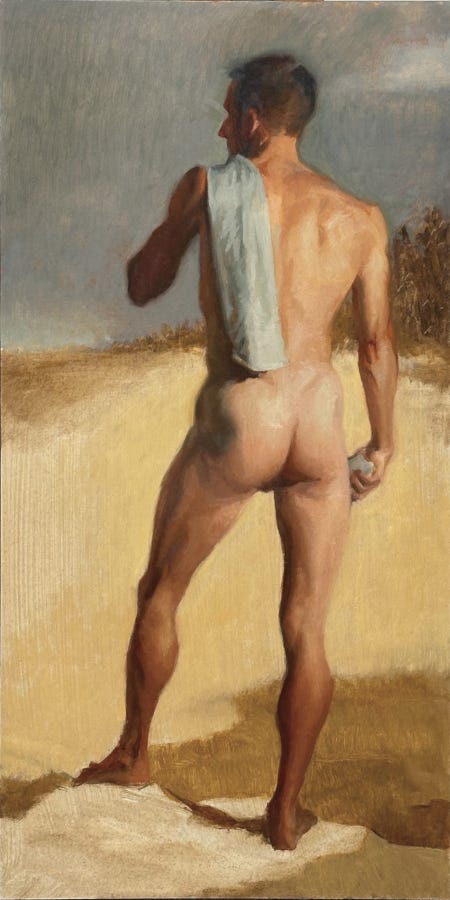
Is it done? I think it’s done enough. There’s blessed little paint on it and huge parts of the background have only the velatura but because the brunaille did the heavy lifting, most of the values were there from the get-go and it didn’t require a bunch of layers. I did this with a basic red-orange/blue palette and I want to try a more compressed pose with the classic red/green. And softer edges. This is a piece that is almost content-less, which is so much easier to do. But Larisa put a bug in my ear and I want to finish her master copy, learn how she thinks.
Wonderful art. Will follow on IG. My handle is george.jazzcat