
Shadows
Opaque? Transparent? Does it matter?

Traditional technique says to make your shadows more luminous and your lights and halftones more solid, you should use transparent pigments in the shadows and opaques and semi-opaque pigments in the halftones and highlights. In this piece, I broke the rule.
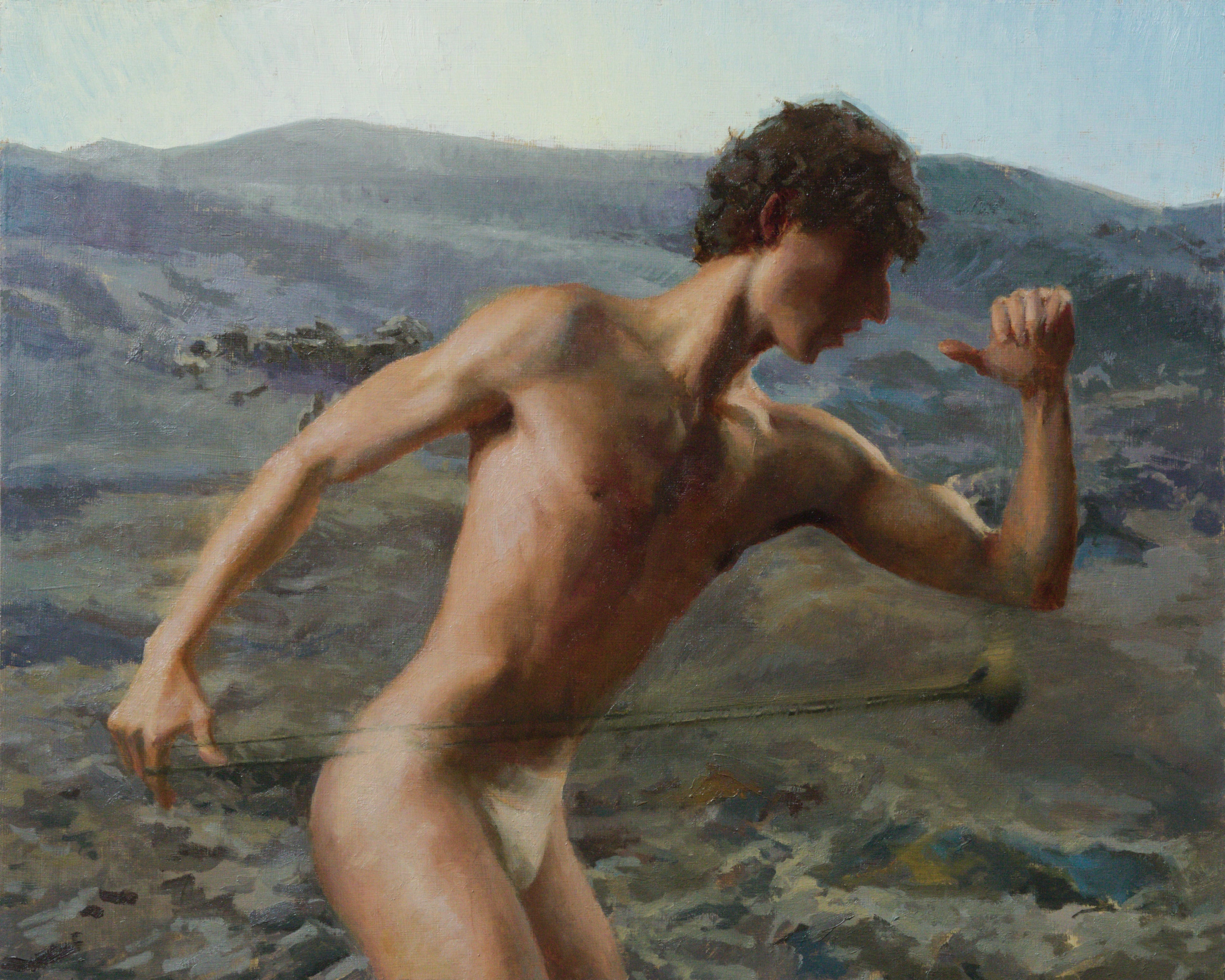
I just finished my painting, “Sling Practice,” and in this piece I did something I don’t usually do and I want to talk about it.
I used opaque pigments in the shadows.
Traditional technique says to make your shadows more luminous and your lights and halftones more solid, you should use transparent pigments in the shadows and opaques and semi-opaque pigments in the halftones and highlights. I’ve been doing that all my life. In this piece, I broke the rule.
John Singer Sargent called that business of using transparents in the shadows “a trick.” Apparently he didn’t limit himself with orthodoxy.
In his book, The Practice of Oil Painting and Drawing, Sargent’s contemporary, Solomon J. Solomon, walks you through painting a standard academic portrait. He uses Indian red in the shadows. That choice really stood out to me when I first read it because it violates the “transparents in the shadows” rule.
How do you know a pigment’s transparency or opacity? Obviously you can tell if the name of the pigment is something like “Transparent Red Iron Oxide” but most paint names are not so obvious. If you’re buying the paint online, look at the “Pigment Information.” It doesn’t always tell you whether the pigment is transparent, opaque or something in between, but it should:
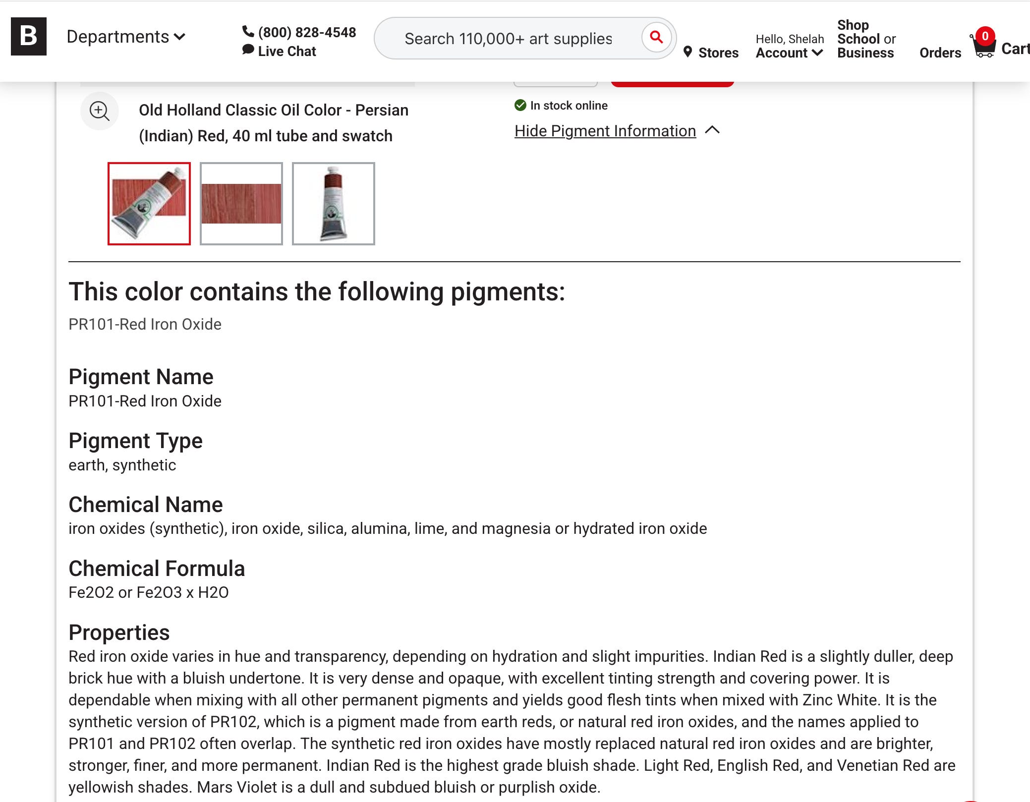
Iron oxides range from completely transparent to completely opaque, with everything in between. Their hues can be anything from yellows through oranges and reds to muted purples. To read that something is an iron oxide doesn’t tell you much. An Indian Red should be an opaque, cold muted red, and the description we get on this Old Holland Indian Red is true to type. However, colors vary from manufacturer to manufacturer and often the pigments that make up a paint have nothing to do with the composition traditionally associated with the color name (e.g., Cerulean Blue or Vermillion), so you should always look up what pigments the manufacturer used to create the paint and what are its properties of transparency/opacity, hue and drying times, so that the paint you buy use behaves as you expect.
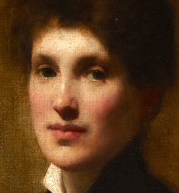
Here’s a detail of Solomon’s portrait of his sister, and while Indian red is not the only pigment he used in the shadows, he probably did use it, particularly on the ear, in the core of the cheek, under the nose and chin, and maybe in the pit of the eye:
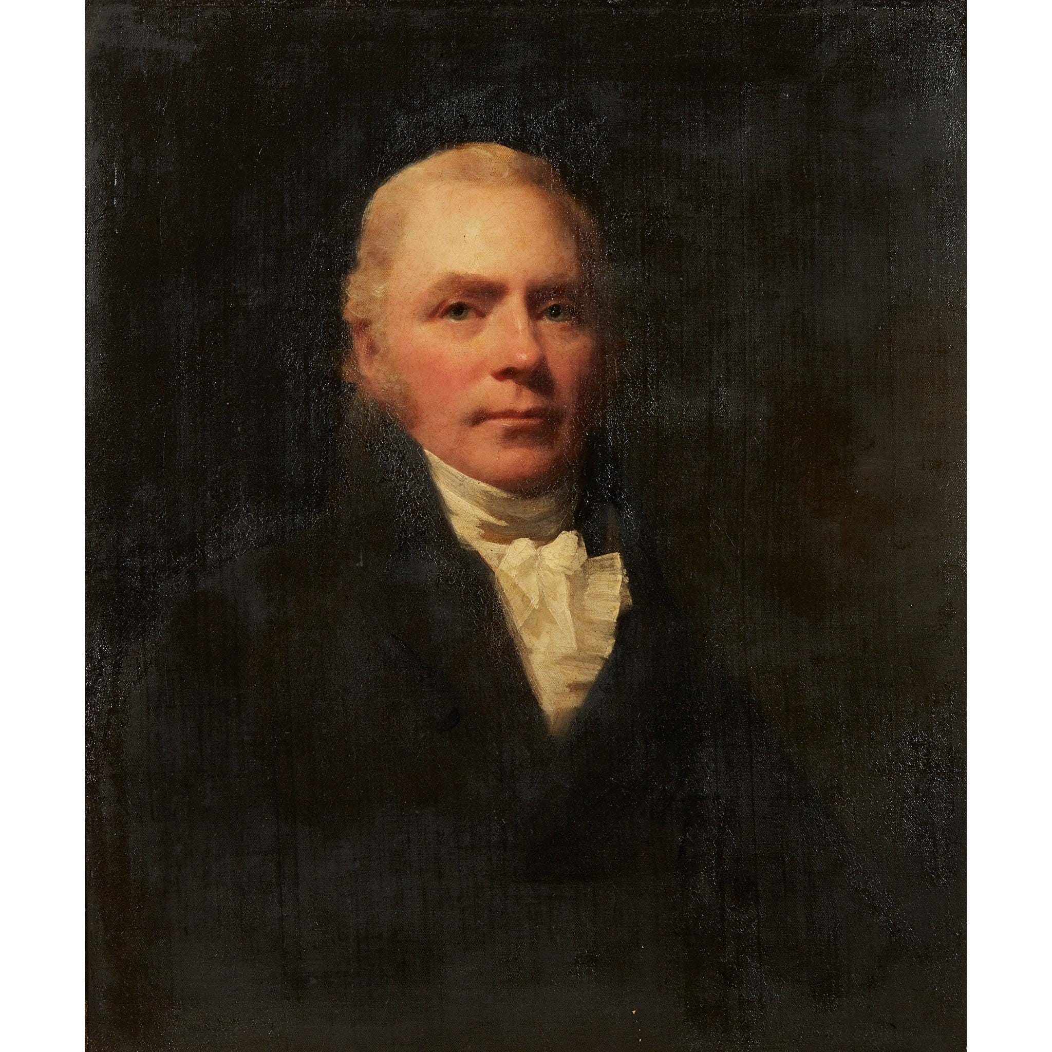
Here’s a Henry Raeburn who predated Solomon by around a century, also using Indian red in the shadows:
Now that we’ve demonstrated the nice effects you can get with this opaque color, let’s just say no color is a magic silver bullet that is going to make all your paintings sing. You need to understand why this color works, because it will not work in all lighting situations, and you need to understand why you might choose a given pigment. Let’s zoom out and talk about what issues you consider when you decide which pigment(s) to put in your shadows.
The first issue is getting the right value. This is more complicated than it sounds. You want to avoid making the shadows darker than you actually see them. Let’s talk about one of your classic shadow pigments, Raw Umber., which by the way is all over Solomon’s portrait of his sister. Raw Umber is a very dark semi-opaque pigment, and as to temperature it’s kind of neutral. Some manufacturers’ versions are warmer, some colder, but think of the hue as pretty much in the middle. Add white to bring it up to the right value, and your shadow will go cold and chalky. This can be OK if you have a very high key painting but usually white in a shadow will kill the piece.
Last year I was outside with another artist who was painting the rocks on a cliff. As I watched one paint, her piece was going very well, and then she noticed that her shadow color was too dark. She was painting on a white ground and she could have just made the paint thinner, but to my surprise, instead she mixed the dark color with white and laid it down heavily. Immediately the piece looked amateurish and inept. A promising piece had died right before my eyes. She could have scraped that off and fixed it, but she didn’t know the solution and because she had a considerable ego and she didn’t ask me my opinion, I didn’t offer it.
So let’s talk about your options for luminous shadows.
You can paint your shadows on a light ground (imprimatura). The pale ground shining through the pigment lightens its value. This works for semi-opaques like Raw Umber or any opaque, but the paint must be thin. It’s not so easy to get the value even, but with skill it’s possible. With a light ground, you can also use transparent pigments to achieve the jewel-like freshness of a watercolor in your shadows, but a layer of a transparent pigments thick enough to give you the right value can look uneven and heavy, so you want to build up the value over more than one painting session. The downside of this method is that since it takes you a while to get to the final value, you haven’t quickly asserted how dark dark gets and it can take a bit of fiddling to figure out your value structure. That’s a serious downside.
Another possibility is to use a pigment that’s not that dark to begin with, so it doesn’t need to be lightened. So, for instance, some people pull out all the stops and use Cadmium red in their shadows. I have a more muted palette so I like the siennas, and this time I tried Indian Red. The cool morning light in my painting above meant that Indian Red was too hot for my shadow so I cooled it down with a greenish Raw Sienna.
On the next trip to the studio, the shadow looked too cool so I lay down a glaze of Transparent Orange Iron Oxide on it and that brought it to what I wanted. If I had used a bit of Burnt Sienna (as an orange) along with the Raw Sienna and the Indian Red on the first layer, that might have sufficed so that I would not have needed the glaze.
What’s nice about having an opaque in a shadow is that it lays down a nice flat even value. It has more body and is more assertive than a transparent, and if you keep the paint thin, the shadow doesn’t get heavy. Best of all, you get the value you want right off. When you use an opaque that’s around the final value you want in your shadow, you don’t have to do that dance that transparents require of you, where it takes a few sessions before you’ve figured out your value range.
So let’s look at Solomon’s portrait of his sister. What pigments did he actually use in the shadow? I would guess it’s a mixture of Raw and Burnt Siennas, maybe darkened with a touch of Burnt Umber, and warmed in places with Indian Red. What pigments he used are what were relevant to his particular lighting situation. Your mileage may vary but the principle holds. The important thing is that the shadow shape is even, warm, and the right value, not too light and not too dark. The transition between the halftone and the shadow is warmed further with a bit of what is probably Alizarin Crimson. Which, by the way, is transparent, and transparents are great for transitions. Alizarin Crimson is notorious for fading but alone as a glaze over dry paint it’s safe. And I think that’s what he used.
Let’s reiterate the principles. If your light is neutral or cold, warm shadows will give you vibrancy. Remember there is no magic color that will make the right warm shadow in every lighting situation, just remember it must be warmer than your light shapes. A nice generic “warm” is in the orange range but it can tip towards yellow or red (or if you’re using fancy lighting, it can be almost any color but that’s advanced so let’s not go there right now). You need to ensure your shadow is the right value, not too light nor too dark, and it’s nice to nail that value right off. While transparent pigment in the shadows can give a lovely effect, opaques pigment can give you a nice even flat shape right off of whatever value you want, if you pick the right pigments. Don’t add white.
I have a bit of a trade history. I knew a few master craftsmen. The tools and materials are available to all, it is the ones who thoroughly understand how and when to use them that are the artisans. I am definitely not an artist, however I recognize and appreciate your mastery of the craft. And, the technical nature of these posts. Thanks for sharing.
This is beautiful. Do you have a gallery? Amazing work.