


Figure in a Landscape vs Landscape with a Figure, Part 2
The Dynamics of Roughly Equal Emphasis

I had this theory that in a painting that involved a figure and a landscape, you had to pick one to emphasize, or else they would fight. I had fallen into zero-sum, rather than “rising tide raises all boats,” thinking. The Irish painter Ann Magill proves me wrong. In her paintings and drawings, sometimes the figure has a little more emphasis, sometimes the landscape, but for the most part, the emphasis is roughly equal, and both the figure and the landscape are better off for the balance. In Magill’s paintings, the figures belong in the landscape, are at peace with the landscape, and the landscape is at peace with the figures. I want to analyze how this is accomplished.
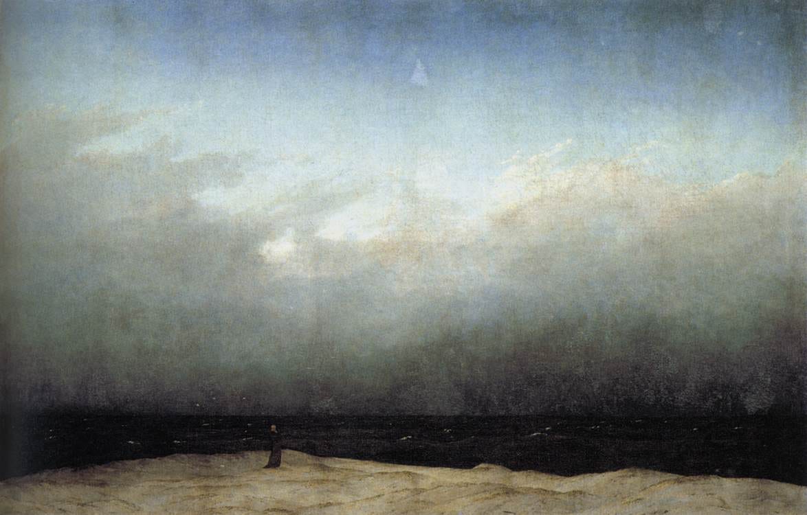
So let’s start where I left off in the last essay, with the small figure in the large landscape. Reader Mary Graham graciously pointed out that Caspar David Friedrich had used the device long before Katja Lang in his “Monk by the Sea,” above. Large blank space, check. Small figure silhouette, check.
So the next question is, how is it possible to have figure and land of equal emphasis when the figure is larger?
Let’s look at Magill’s 2004 painting, “Eclipse,” which essentially blows up Friedrich’s tiny figure. You would think that with the large size of the figure, all you would look at would be the figure, but no:
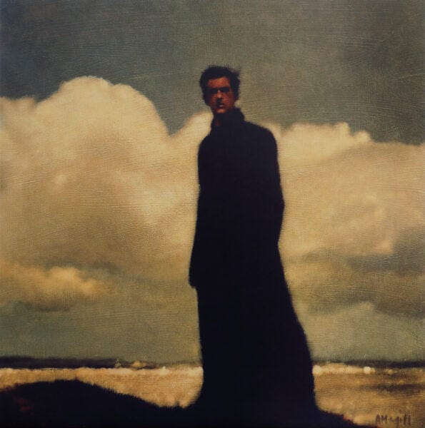
The large size of the figure and its proximity to the viewer would lead me to call this a figure in a landscape, but when you really look at the real estate, the landscape is bigger. In both, detail is minimized, and that’s the critical thing. Is the painting about the figure? Or is it about the landscape? My answer would be, “Yes.” If the sky were not so dark around the head, where there is some detail, your eye would go straight there, but blur your eyes, the whole region goes roughly to dark along with the sky. The areas of greatest contrast are either where the figure is silhouetted and completely flattened — which prevents your eyes from lingering — or towards the edge. The areas of detail are also areas of value compression, which is fascinating, because that means that the balance between figure and ground are effected by juxtaposing high contrast big shapes which don’t grab your eye because they lack detail, against small shapes which don’t grab your eye because they lack contrast. Your eye dances all over the painting, calmly, evenly.
Notice that all her edges are soft. Not woolly, but soft enough. Moving forward, she did a lot of edge experiments that I find interesting.
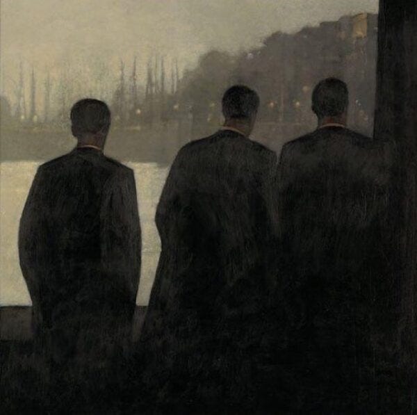
Let’s look at her 2009 “Homecoming.” Here, the edges on the figures are pretty sharp. Not razor-sharp, but clear. The landscape elements in the distance have more detail and blurrier edges. You could argue that the subject is the landscape because the figures are almost completely flattened, but the values are very compressed in the big landscape masses too. The fact that the foreground figure silhouettes take up most of the real estate argues that this painting is really about the figures, about the reaction of the figures to the landscape, but there is that tension: which elements matter more, the figures or the landscape?
Moving on, she blurred the figures more.
Here’s 2019’s charcoal drawing, “Murmur,” which is stronger than “Homecoming”:
We have the same devices of the turned back and the light collar against dark coats as in “Homecoming” and a lot of the landscape/figure dynamics from “Eclipse” are going on here, but the figure is far blurrier than in either piece. Maybe the sharpest high contrast edge is on the figure’s collar, which pulls the eye straight to it, while lights to left and right in the sky pull it back around. Again, the sky is quite dark, almost as dark as the ground, and these exaggerated dark areas mitigate the contrast against the black areas of coat and hair. But the most interesting thing, to me, is that the edges are very sophisticated. You get the impression that everything is blurred but it isn’t. Note that countering the sharpish edge within the figure, sharpish edges within the clouds crisp the general impression and direct the eye away from the figure, across the landscape and around the composition. I think this edge play, combined with the general mitigation of contrast between top and bottom areas of figure and ground, are what give us the equal emphasis, figure to landscape. Truly a very delicate dance.
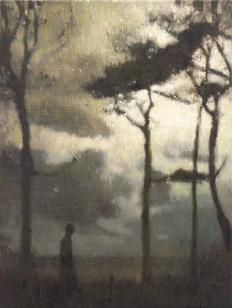
Magill is always experimenting. From the same year (2019), she has a piece where not only the figure but also landscape elements are silhouetted, and the figure and the trees have about the same amount of blur. The effect, once again, is to place the figure at home in the landscape and the landscape at home with the figure:
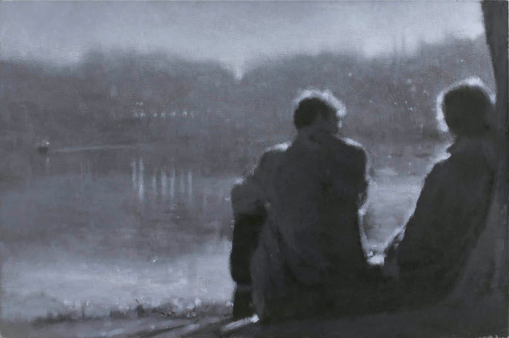
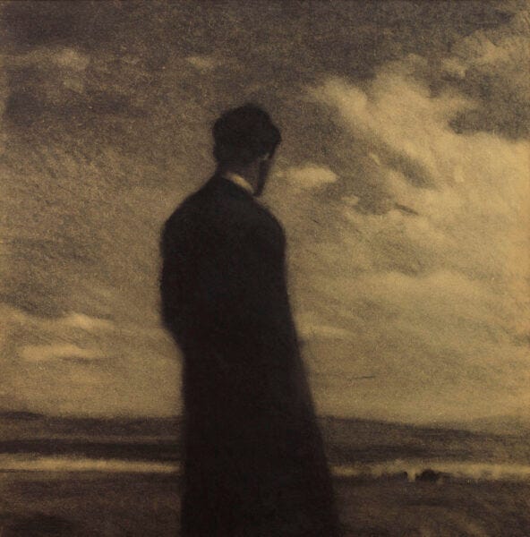
Her 2021 show, “Walking the Land,” contains a couple of paintings that experiment with rim light and they’re some of her best. “Evening Light,” the first painting shown in this blog post, is a refinement of the kind of composition we saw earlier in “Homecoming.” There’s the water, the distant trees, the back view of silhouetted figures, themselves framed by walls (“Homecoming”) or a tree (“Evening Light”). “Evening Light” is more successful and it’s worthwhile analyzing why. First, the silhouettes aren’t as dark. There is some detail through very compressed value. The landscape in “Evening Light” is also treated very differently from the one in “Homecoming”. It comes all the way down to the foreground on the left, leading us into the painting. The water has more and subtle articulation. The landscape’s big shapes are far more blurred, and once again, any sharp edges are within areas of very compressed values. There is so much blur in the landscape that it gives Magill more latitude for the amount of blur in the foreground figures — a little blur reads as a sharpish edge. The rim lighting is very soft because its edges are soft and they graduate into and out of middle tones. The darkish values of most of the landscape mean that the figures lose and find their edges in a very alive way. Her shapes are big and monumental and the edges do all the heavy lifting.
“Evening Light” is such a compositional tour de force that I’m sure Magill heavily edited the scene she painted, so that by necessity, a lot had to have been from imagination, and the painting was only guided by sources. Of course I wasn’t there while she was painting it, but I see a pattern in her work. She favors large masses and compositional decisions are foremost. When you watch videos of her painting, she revises extensively and relies on opaques to give herself the freedom to make those revisions. Her videos show that a mass that started out black could suddenly become grey or even white. She revises and moves things around freely. Magill is not someone who starts with a line drawing and “fills in.” She works with masses, starts with big masses and refines down to tiny shapes and edge decisions. The videos demonstrate that although she gives serendipity and chance free rein, her chain of decisions is profoundly considered.
Magill’s paintings are evocative, majestic, grand and graceful. She has gotten this good because of her courage to constantly experiment and follow threads of development. In my mind, the fact that she’s such a consummate artist, combined with the fact that she has solved the problem of how to make figure and landscape coexist peacefully with equal emphasis within a painting, make Ann Magill one of the best painters working today. She is very much worth study.