
A Chat with Sol
Picking Solomon's Brains

My last post reminded me that I had more to learn from Solomon. The Lyme Academy featured the painting of his sister in an exhibition in late 2023, and I have the catalog, which has a terrific detail on its cover:

I knew from his book that Solomon painted thinly but it wasn’t until I saw that photograph that I realized how thin was thin. He practically stains the canvas; there is almost no paint there. His version of impasto is what any other artist (except for maybe Whistler) would use for any old passage. Is this desirable? It wouldn’t be to some people. I like the look.
Actually I fricking love the look and I want it.
Back when I started atelier training in 2019, I copied this painting. I decided to copy it again, because I know more now and I can get more out of it. But I don’t need to copy the whole thing. I’m not interested in the whole composition. I’m interested in how he paints the face. So I’m going to try it again. Another conversation. See what he has to say.
Here’s the full piece:
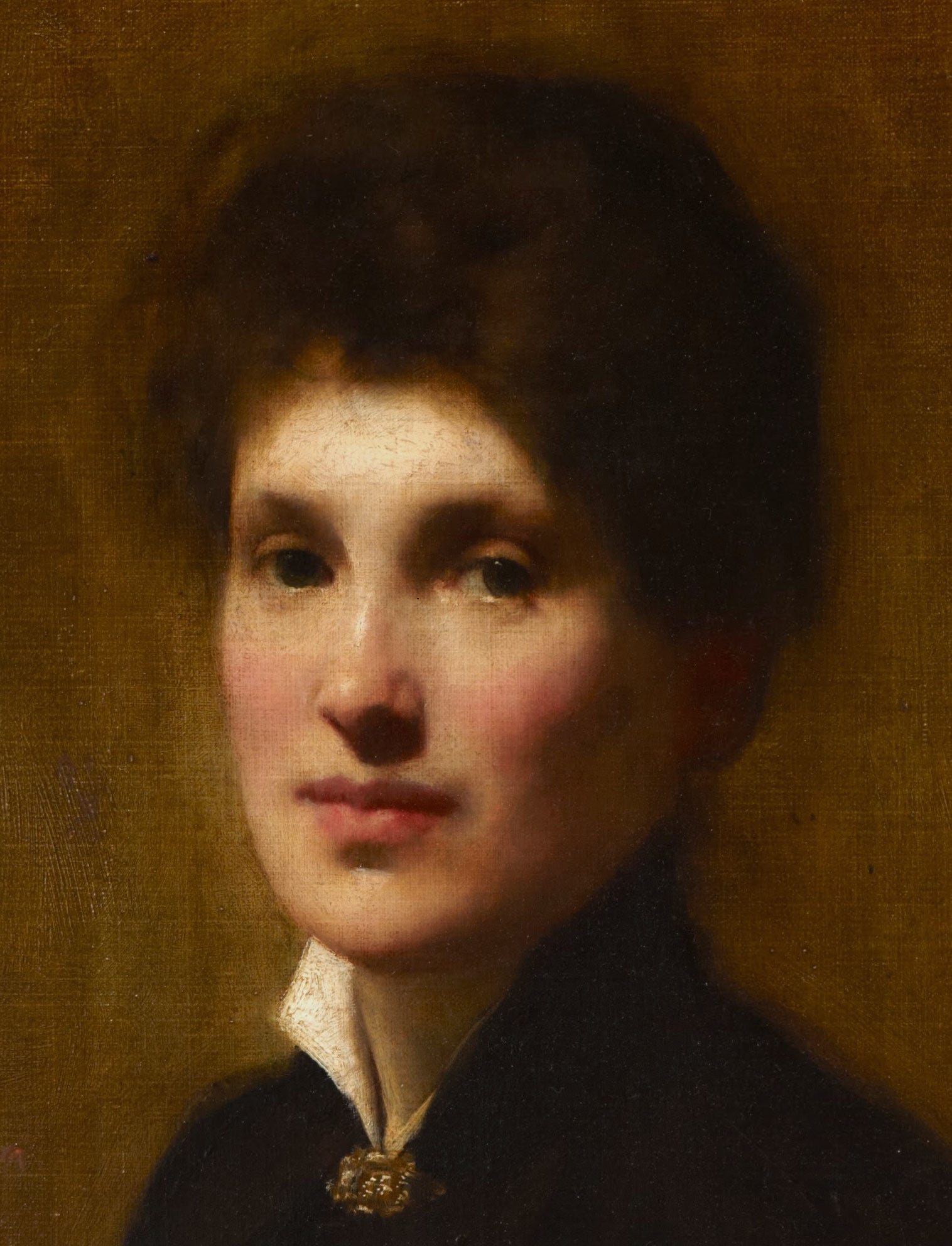
Maybe you think oh ho hum but I think this portrait is ravishing. A lot of old portraits are all mask, the image the subject wants to project to the world. There’s an intimacy here that’s rare. A combination of solidity and serene liveliness; it’s a magical portrait. And it’s a painter’s painting, with perfect technique. How did he do it?
As with any master copy where you’re working from photographs and not from life, it’s hard to tell exactly what the palette was. The Lyme palette is colder and less yellow than the palette in the reproduction of the whole painting above, so I had to pick one. I picked the image above. Will it allow me to trace his steps? Will I mix something, say, too yellow? Maybe. Who cares. I will still learn.
For this piece, I needed a surface with a real linen weave, because Solomon’s work is all about the weave of the canvas. He says right out, as soon as you lose sight of the weave, your work has become too heavy and it has lost its freshness. I have found that to be true in my own work. Colleen Barry and Will St. John both talk about how a painting can take two, three layers and then it starts to get heavy. I’ve tested going past that. They’re right. Thin is best.
I needed a surface with a proper weave and couldn’t just use a piece of paper or a piece of Masonite, or even that godforsaken awful Arches canvas paper that blighted my Velazquez copy. A few years ago, I was gifted a 6x8 inch Raymar oil primed linen panel as swag at some art event. Gorgeous thing. I had been hoarding it.
I gridded it up and drew his sister with pencil. When I grid up a piece, I get the drawing in and then I erase the grid, which means I have to get the drawing in before there’s any paint on the panel because paint would interfere with erasing. That meant I had to draw it before laying down an imprimatura. So be it. I drew it with a #1 sable rigger (round brush with very long hairs), using Raw Sienna mixed with a medium that was 1:1 spike oil of lavender and linseed oil. Why did I use medium at all? Because I planned to go back over it with an imprimatura, and if I only used a solvent, the drawing would come back up. It needed a proper binder to keep it down. Why did I use Raw Sienna? Because that’s approximately the hue I saw in the imprimatura. I wanted something close enough to the imprimatura that I could get the drawn line to disappear if and when I wanted to lose an edge. Not so light that I couldn’t see the drawing, and not so dark that I would be forced to cover the drawing with an opaque later.
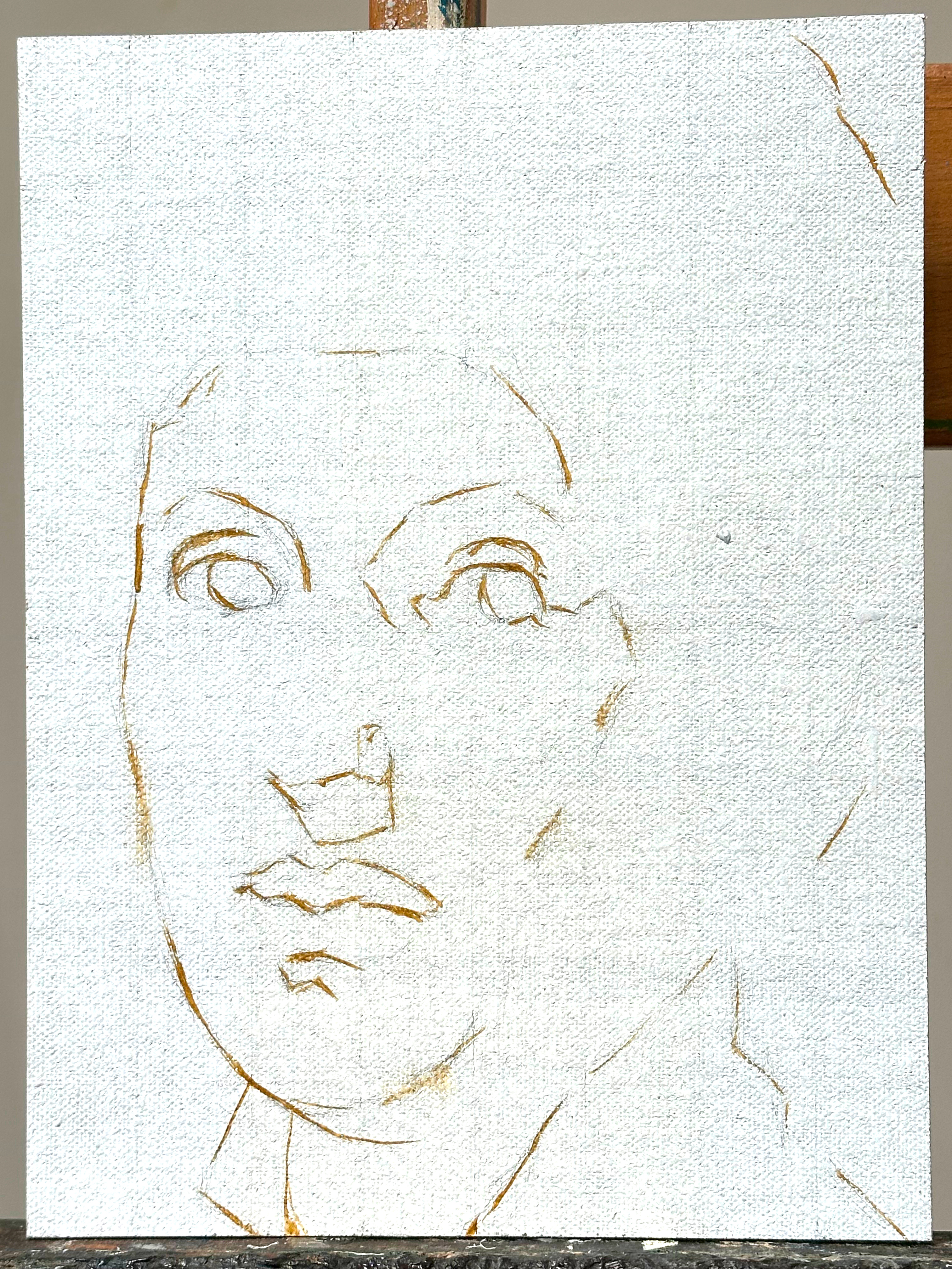
Gave it two days to dry. Today I got started with the actual painting.
I took a good look at Solomon’s imprimatura and decided it’s not Raw Umber. It’s not Raw Sienna. Take a look:
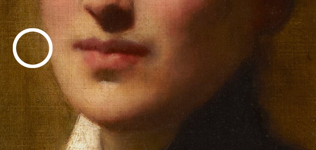
It’s Raw Umber with a lot of Transparent Yellow Oxide, which was a very pleasant surprise. Already he’s taught me something. Remember, Raw Umber is an opaque or a semi-opaque. Depending on the brand it can range from dark gold to a warm neutral to a brownish olive green. I favor Old Holland’s Raw Umber because it’s the most gold, but it’s still not as gold as we see here. Adding Transparent Yellow Oxide makes the color sing. Raw umber alone would be too dark and the Transparent Yellow Oxide lightens it up just enough. For that lesson alone the master copy was worth doing.
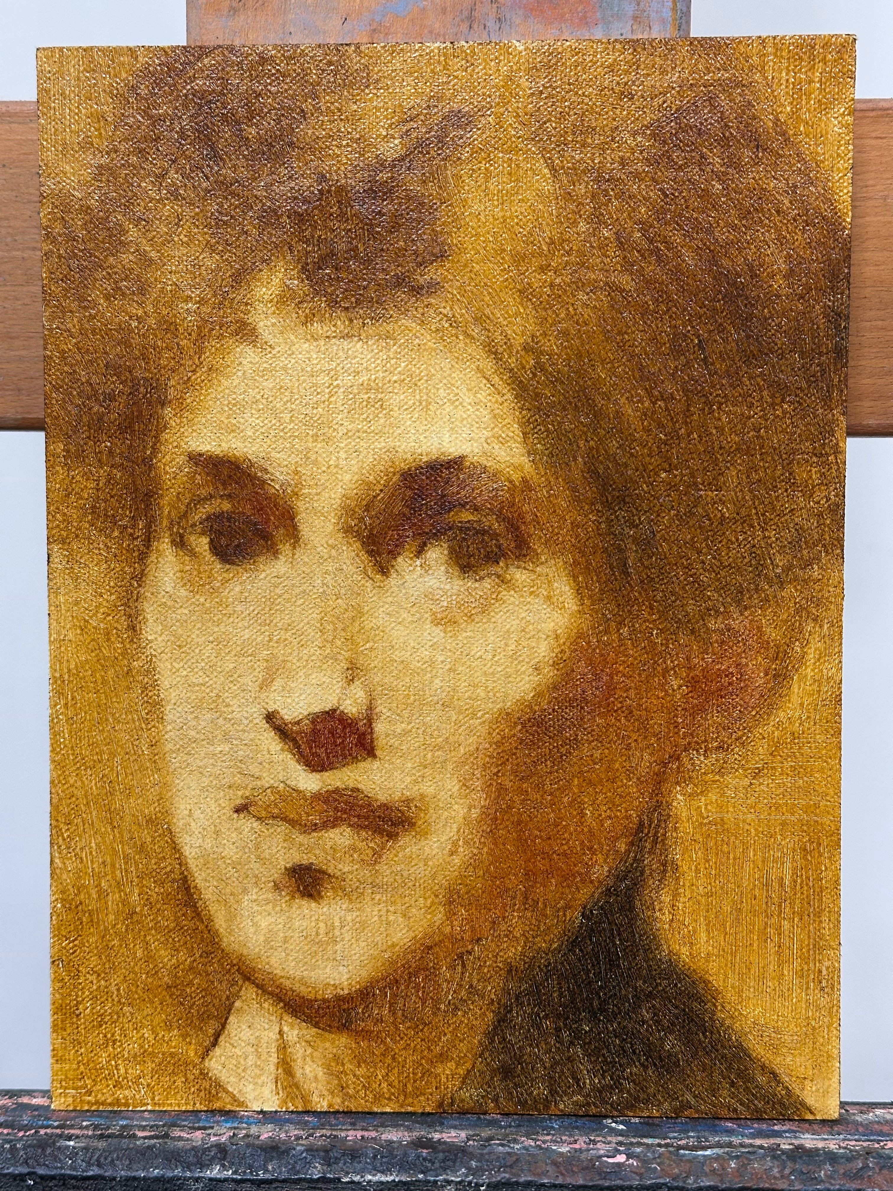
I figured Solomon probably used turpentine to thin down his paint for the imprimatura but I didn’t want to put my lungs through that so I used spike oil of lavender instead, and that was another revelation. Because although spike oil is a solvent, it’s an oily solvent. I laid down the imprimatura with a #8 Robert Simmons Signet bristle flat, and to my surprise, the combination of spike oil on top of the panel’s oil ground meant that the paint moved around quite easily. It wasn’t slippery like painting on glass; it was just perfect. It took almost no effort to get an even value. I didn’t need a fluffy brush, didn’t need a fan brush, just that bristle flat did the trick. Even a “nonabsorbent” acrylic ground gives you a bit of an argument on your first layer, but the spike oil on the oil ground meant the paint just behaved.
It is luxurious to have the paint just do what you tell it to do.
Now, a #8 flat is a wide brush, it’s maybe 3/4” across, and the face is just under life size, and I could see that that big brush would be good for working the big masses. So I kept on going with that big brush, and it worked, largely because bristle is stiff and can be used to lay down or remove paint, depending on your pressure and control, and the surface allowed the paint to do what I told it to do instead of getting absorbed into the ground. The big brush gave me nice big masses without a fussy look. When I needed a little more control, I went in with a #4 Escoda Optimo Kolinsky round. And it just did what I told it to do, it was an amazing painting day.
I used to know a small engine airplane pilot, and he told me that his flying habit was as expensive as cocaine. An attachment to Kolinsky brushes, by the way, is about as expensive. I understand that watercolorists can keep these brushes for years. For me, they’re at their best the first day, and they remain good for maybe three sessions, although I usually stretch them to limp along for a couple of years. Some people love worn out brushes, but I don’t. I’m really kind to my brushes in cleanup and storage, but I go through Kolinsky’s like potato chips. The hairs break against panels and they abrade on canvas. I try to use cheaper and kinder synthetic substitutes whenever possible but the action of a real Kolinsky, well it just makes a perfect point and it never goes clumsy as it comes off the surface, and I haven’t tried a synthetic that can compete.
I know my shadow is not as dark as Solomon’s. That’s on purpose. To keep the paint thin, I will build up the shadows in two or three layers. I’ve got the black jacket indicated to get a sense of how dark is dark and how cold is cold, but I’m not going to commit to the final shadow values until I have the halftones in and I know how light is light and how red is red.
I didn’t start the halftones because once you start that, you have to follow through. You have to make decisions at peak performance for a couple of hours. I was already getting a little mentally tired after what I had done so I called it a day for the giornata. Some people can go all day, I can’t. I’m a sprinter, always have been. I always ask myself before I start something that will take sustained concentration, have I got the energy and the focus? because if I don’t think I can make it to the end, if I think the quality of my decisions will slack off, if I think I’ll get to a point where I start fudging things, I don’t start that segment of the work. Better to do it when I’m fresh. Better to do it right the first time than to have to fix work that was messed up because I painted it tired.
However, one thing I’ve noticed while doing this copy: Solomon is very fast and loose with his Transparent Oxide Yellow and it really jazzes up his colors. When he mixes that yellow with Indian Red, for instance, in the shadows, the mixture loses the plodding stolid quality I often associate with Indian Red. It sings with an internal glow.
So tomorrow I’ll continue with this adventure, and see where it takes me.
I always theorised that he scrapes down rather than paints thinly, which he mentions a couple of times, I think. (As a tip for drying and when warning about paint build up?) Supposedly Bouguereau scraped as well. You get a different look, dithered, soft in a way a brush will never manage. And it ends up not mattering if you use transparents or opaques.
So interesting. Thank you.